VENOM by James Patrick
With the announcement of a 2 week lockdown imminent I knew I’d have to rapidly decide on an artwork to bury myself into. I was stuck between Sub-Zero from Mortal Kombat or Venom and decided to post a poll on Tiktok and let the viewers decide which path my pen would take, and well here we are. I love the style of Venom and I felt like it was very much in line with my illustration style.
The first step I take in any artwork is to research and fully explore all the ways the character has been represented previously, and with this in mind think about how I can build from this in my own style. I really don’t want to simply recreate something that has been seen many times before as it’s simply boring for me to create and most likely the same for the viewer to see.
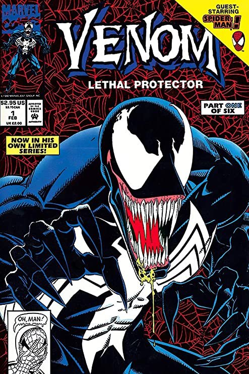
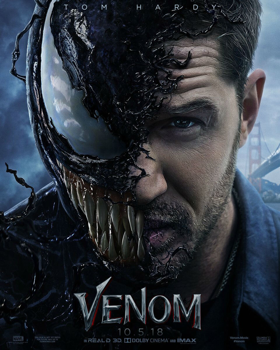
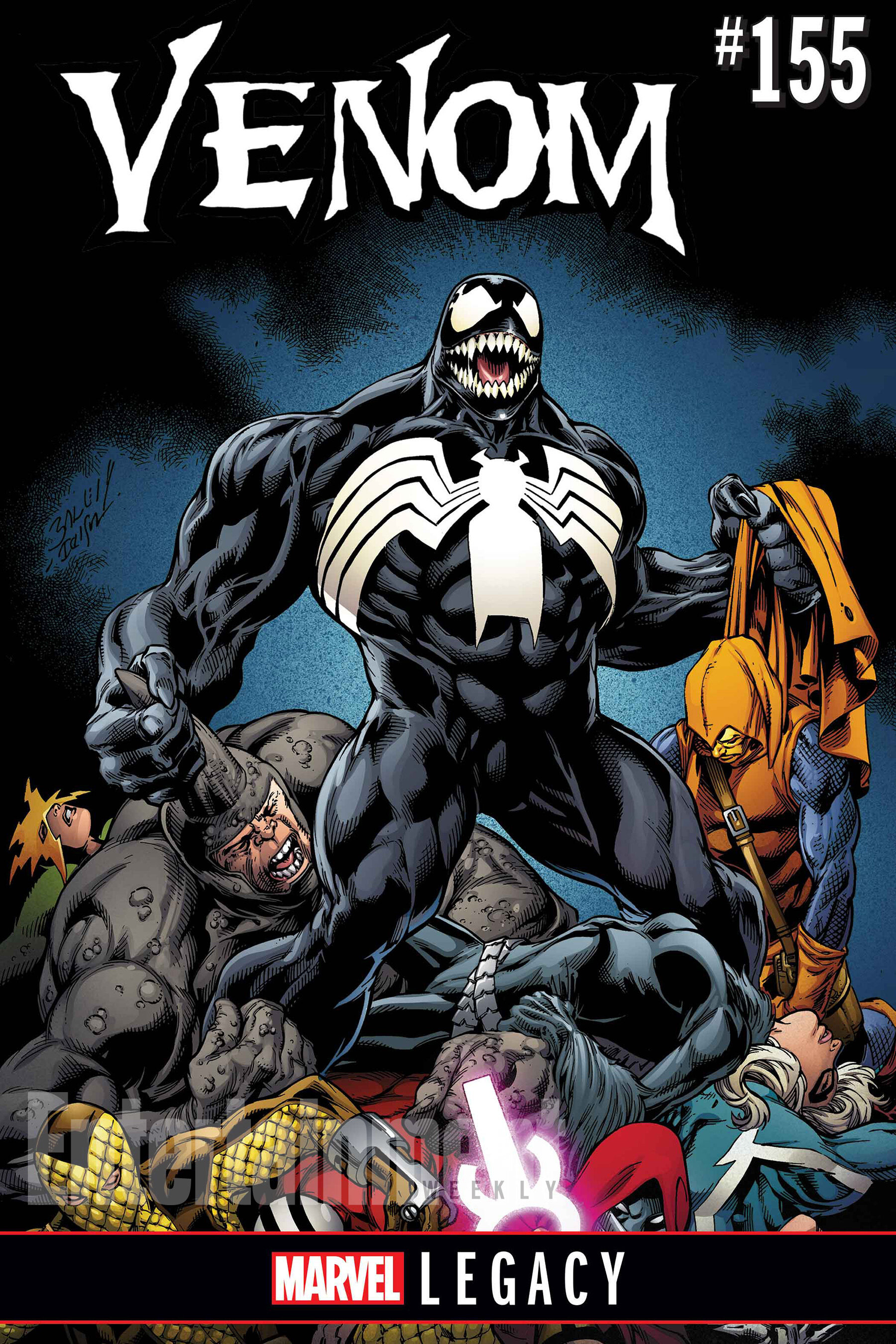
Venom is an interesting anti-hero, and one of the most notable things I noticed throughout looking up references and source material was that Venom seem to be drawn in a similar way, in a similar setting with a similar colour scheme. Below you can really get a sense of what I mean:
Armed with this, I brainstormed ways I can slightly change the way Venom was seen in my drawing, without losing it’s essence and alienating the viewer from Venoms main style or character. I’d noticed that Venom had seldom been represented fused with animals and mostly was seen with humans, in most cases Eddie Brock whom was the main protagonist throughout the series. Being a huge fan of Tigers and thinking about how perfectly the tigers natural colours would work with the grey, blue tone that Venom is mostly seen in I thought this could be a great experiment.
Usually before I start a drawing ill search online and see if someone else has done something similar and in this case I couldn’t find anything. It’s always an exciting feeling when an art idea I have seems to be one thats truly original, which almost seems near impossible these days. With a rough idea of colour and styling I worked tirelessly over 14 days on the drawing holding myself focused on my main goal of creating a heavily detailed original work.
Building off what I’d learnt from my 2019 Monkey King vs Goku artwork as pictured below, I decided to add a similar frame around the artwork to help hold all the moving elements together.
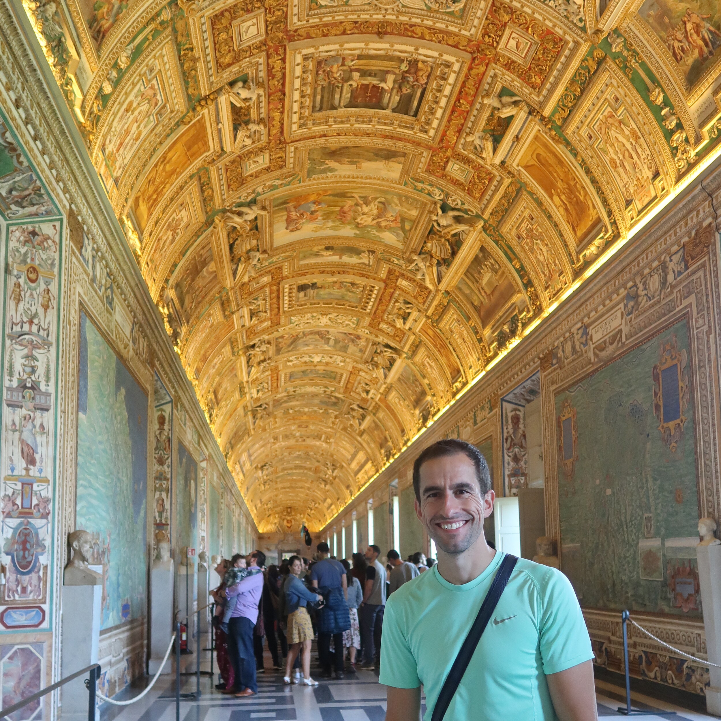
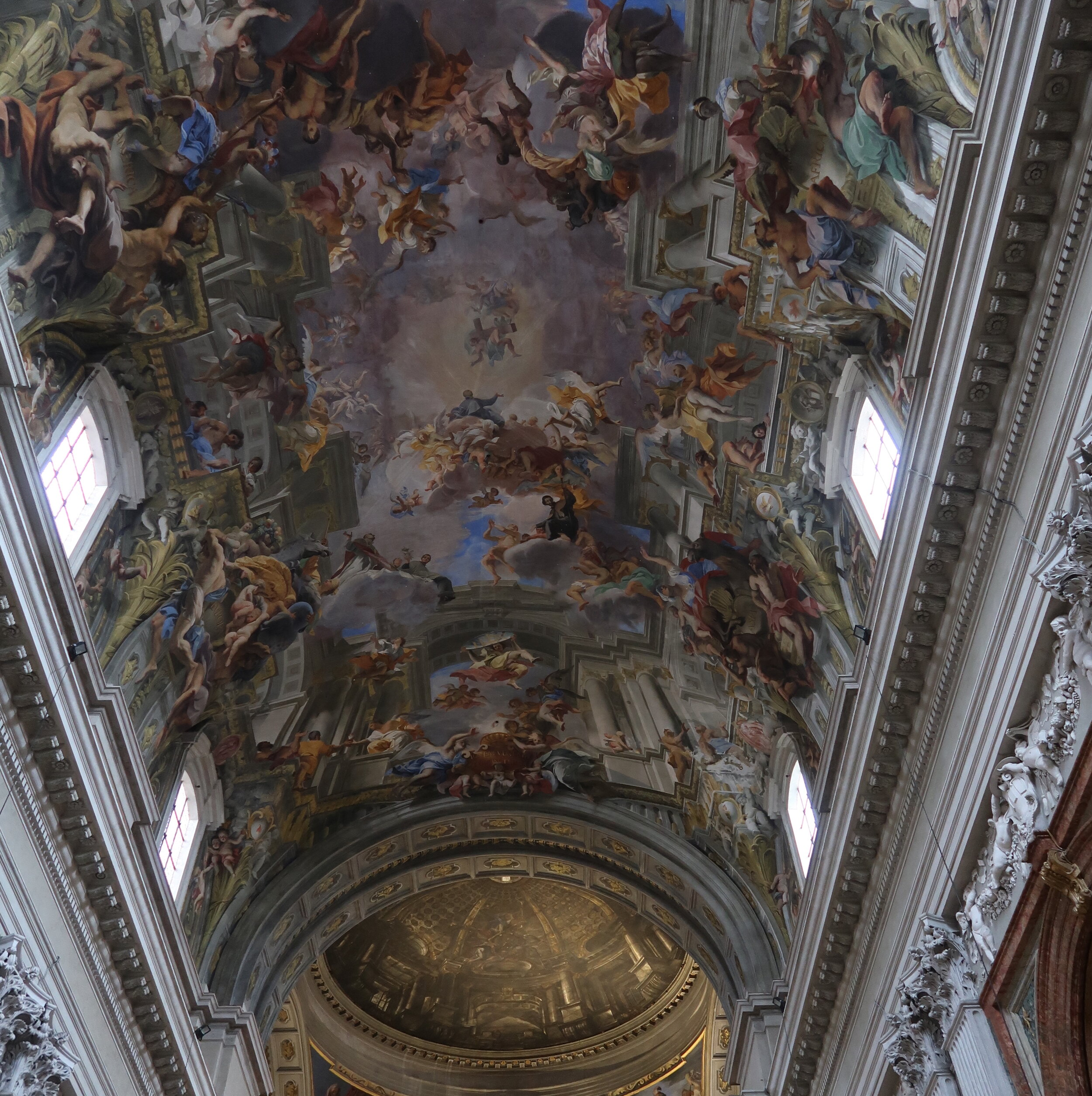
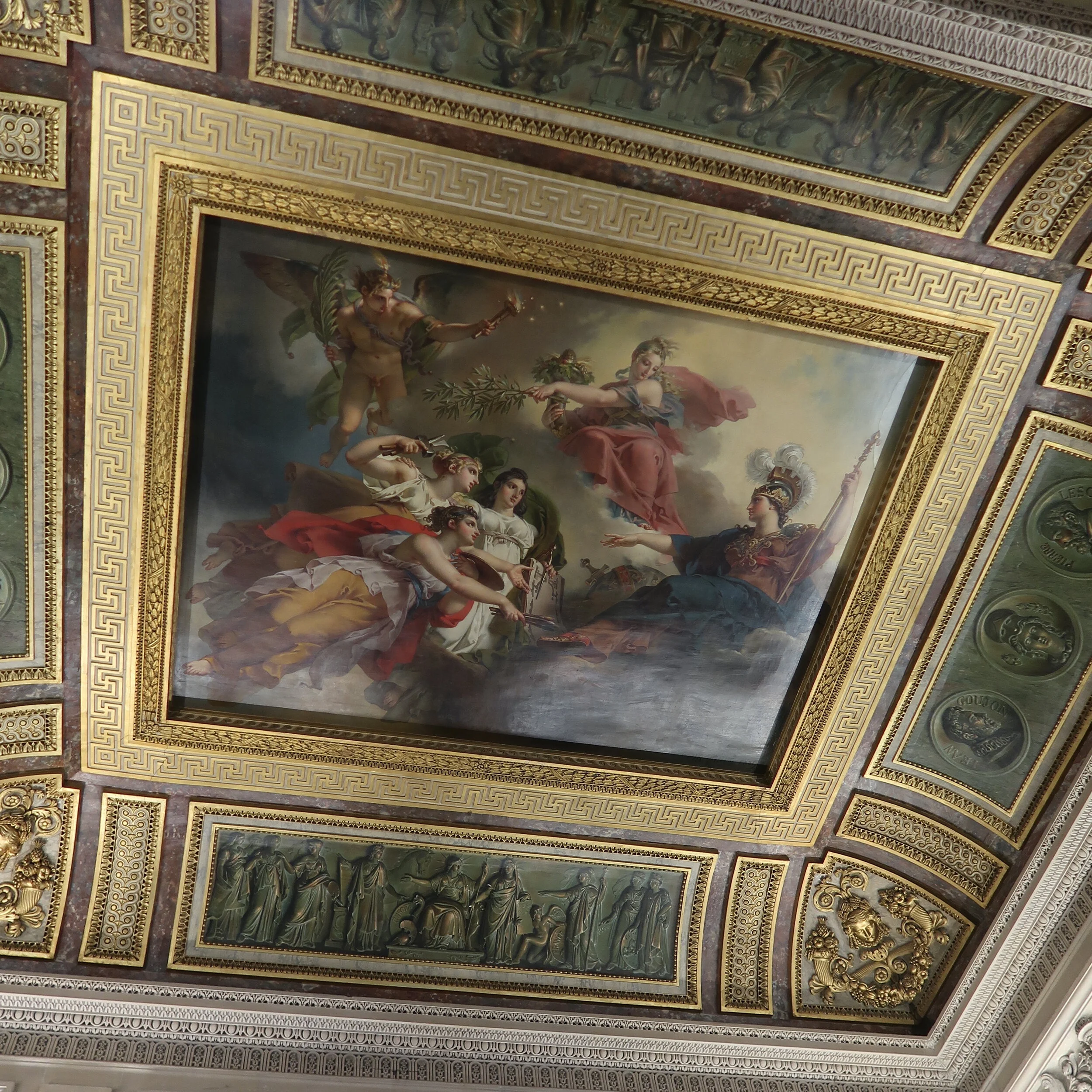
The idea of building a frame within the Artwork had come to me in 2019 when I had travelled to Italy, France, Spain and noticed a few key artistic choices the masters had made. Prior to this I’d always struggled with packing in way to much detail into an artwork but almost turning the entire artwork into a mush of chaotic spaghetti for the viewer. I’d noticed throughout many of the large cathedrals which housed some of the most detailed and mind blowing art on their ceilings and walls, the viewer was always at ease due to the almost mathematical way the art had been designed. Separating each detailed element with a frame or structured guideline almost helps the viewers eyes not get too lost in the entire piece but rather able to view each part easily whilst properly visually digesting the detail section by section.
Much like the Characters Goku and the Monkey King, VENOM is a character that is mostly represented as a moving, flowing and energetic creature so it was important to capture this but almost build some contrast into it to help, and below is the Result:
Thanks for stopping by my Blog. I hope you’ve enjoyed hearing about this artworks development.
If you have any questions feel free to contact us here.
